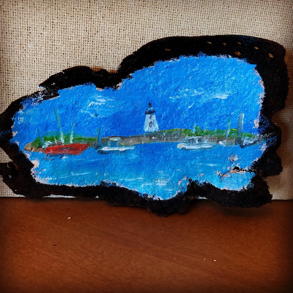
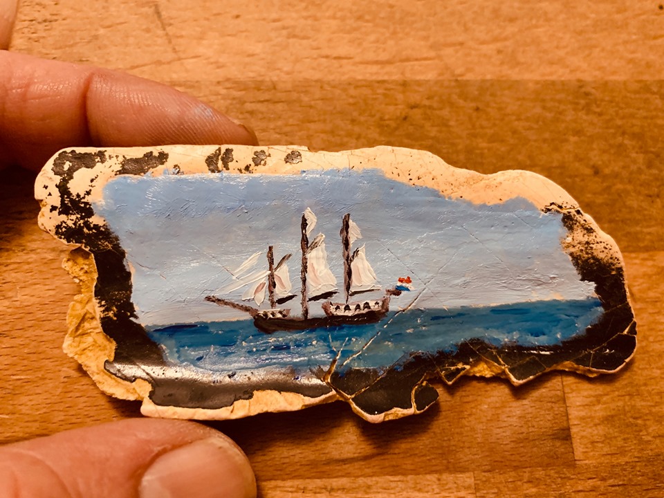
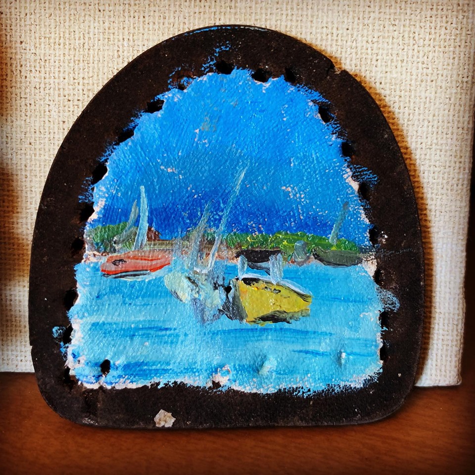
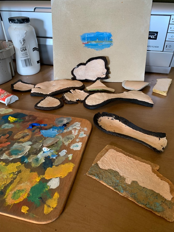
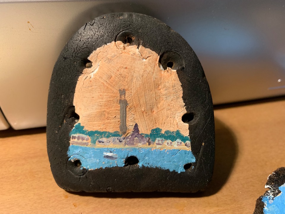
For many years, Matt and I worked to create a more sustainable lifestyle. Our life was a struggle to raise crops and animals, bake and preserve, and still have time to work and relax. There was never enough time for it all.
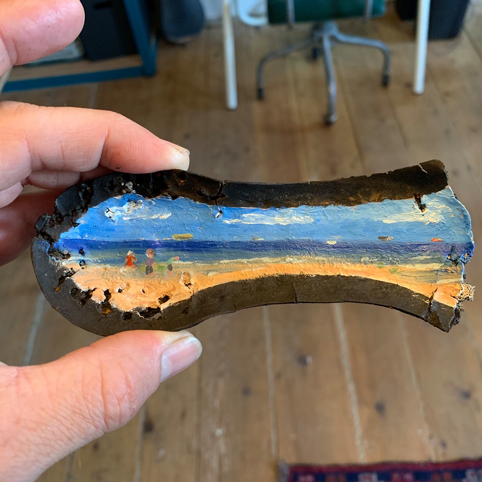
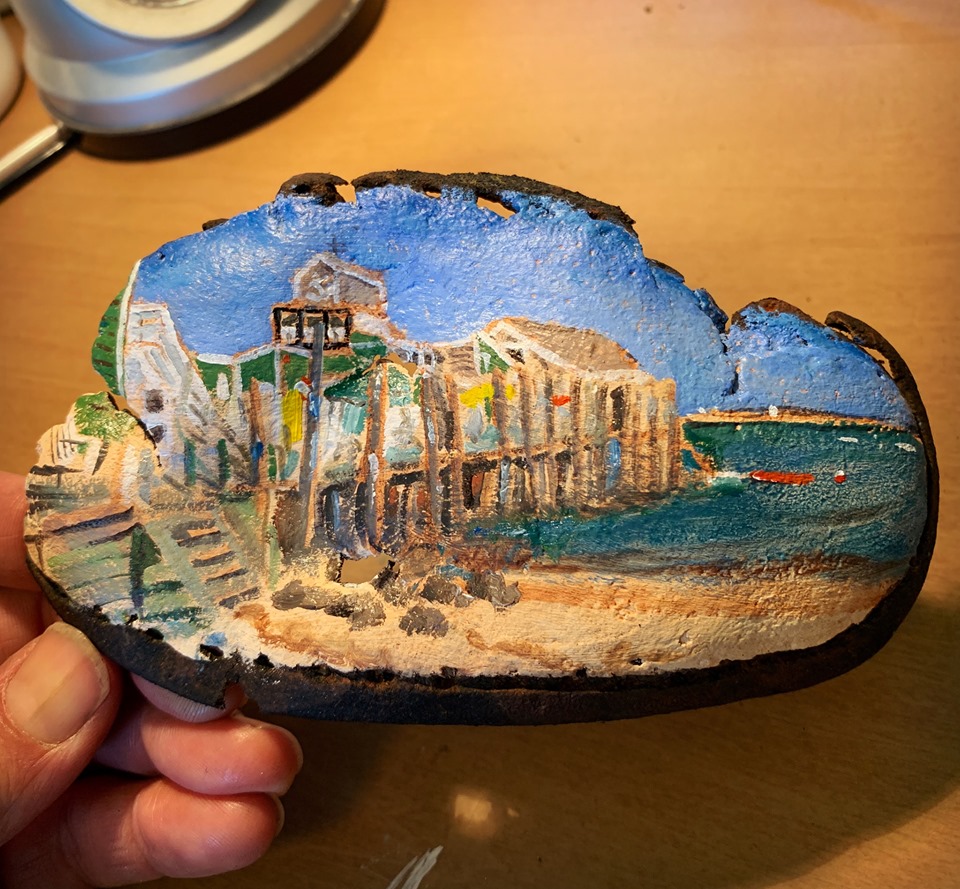
I used to get up every morning at 5:30 a.m. I would work out for about 15 minutes; shower and dress for 15 minutes; make coffee and do dishes for 15 minutes, then paint for 30 minutes before rushing to get to the train at 7:11 sharp. When I got home after 5, I would walk the dogs and paint for another 30 minutes before Matt got home after 7, when we would eat and chat before having to do it all over again. But, when walking to the train every morning, I would focus on the future. The future can take many paths. If you’re not traveling down a path, you’re not going to get anywhere.
I would think about my art, my website, this blog. I would think about the house, repairs, and yard work. What did I need to do to push ahead? Everything had to have forward momentum. Without it I would feel useless—like a mouse in a running wheel. Sometimes, just sometimes, you can take that wheel, put it on its side, and use it to climb out of the cage.
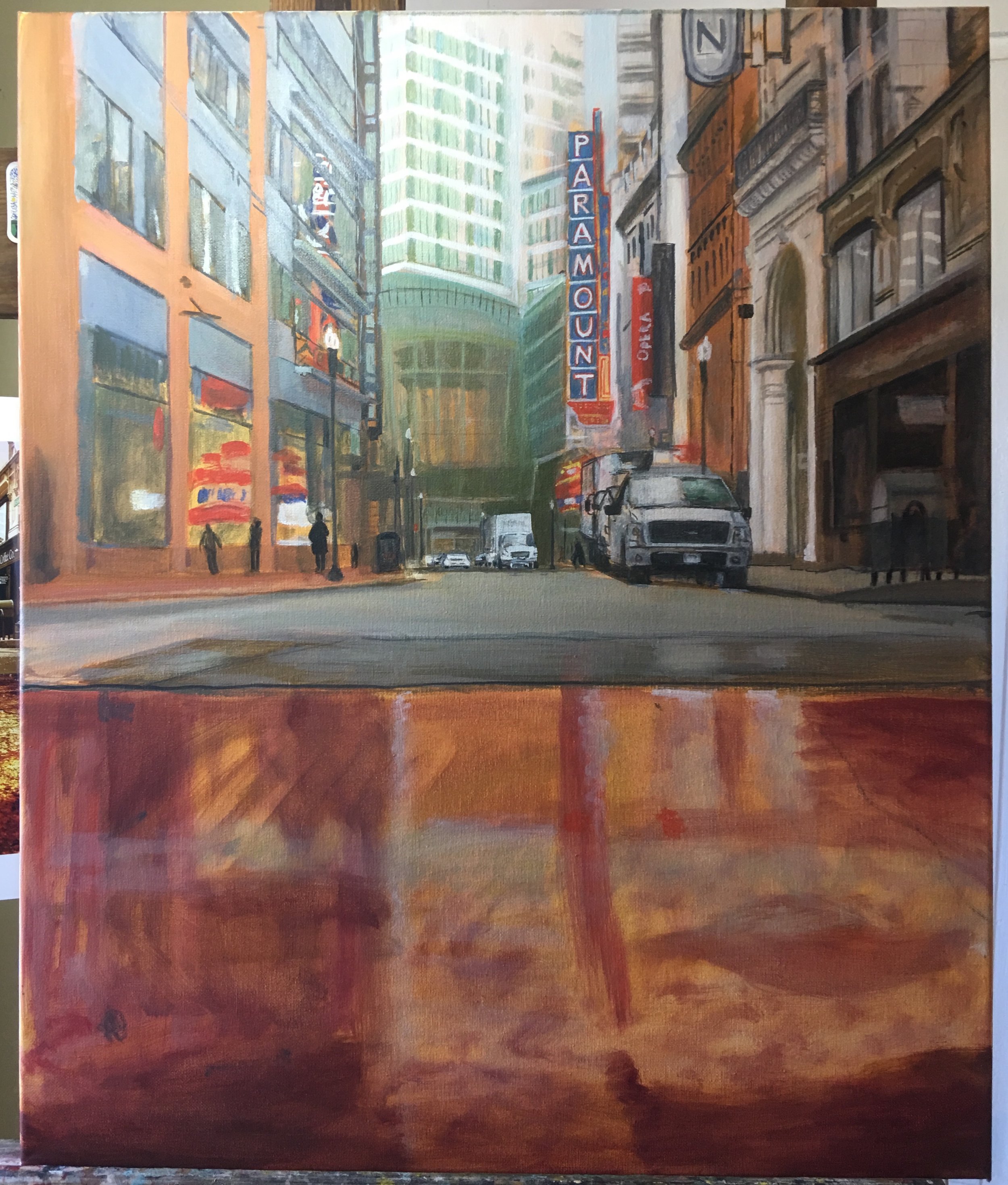
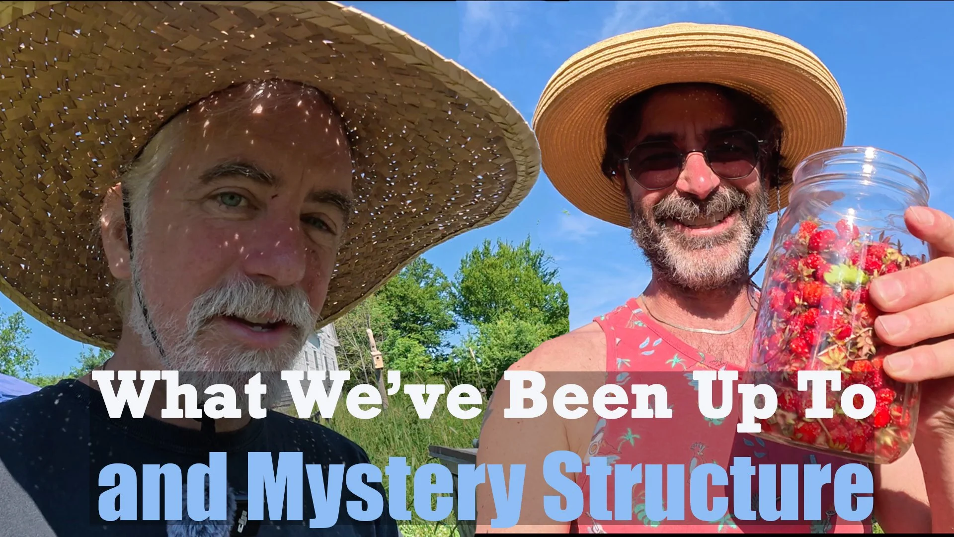
So here we are, in Downeast Maine. A far cry from the noise, the traffic, and the stress, of urban life in Massachusetts. We wake up to roosters, not sirens. We’re not “working out,” we’re “working the farm.” And though we’re not currently making art, we are making… Videos! On our new YouTube channel, Life on Pumpkin Ridge!
We hope you will join us there to see what we are doing to the property, and what we do every day, as we live our future.